Make your own pop art

| Saturday, August 9, 2008

The pop art movement of the 1950s celebrated the birth of consumer culture, taking mundane things like the humble soup can out of the supermarket and into art galleries – often for the very first time.


It’s a distinctive, tongue-in-cheek style that’s still relevant today – after all, our society hasn’t got any less consumer-oriented. This means that pop art is a useful, versatile visual shorthand for 21st-Century designers, instantly evoking kitsch, with a sharp note of satire. In this masterclass,

Mark Mayers shows you how to get that pop art look using layering, the Live Trace tool, filters and some cleverly chosen images.


01. In Photoshop, open Bubble_car.tif from this month’s CD and clean up any stray pixels with the Brush and Eraser tools. Draw a closed path around the people, make a path-based selection and then hit Delete. Next, erase the number plate and bonnet logo and save the image to a convenient location


02. Open Colour_distress.jpg from the cover CD, convert it to CMYK, then save as a TIFF with no compression (see tip box, right). In Illustrator, create a new CMYK document 430-x-307mm. Make a rectangle 420-x-297mm, position it centrally and select View > Guides > Make Guides. Next, go File > Place, select the saved Colour_distress.tif and align to the guides. Label the layer ‘Placed distress’ and lock it.


03. Place the bubble car image on a new layer labelled ‘Car’. Select Object > Live Trace > Tracing Options and use the default black-and-white settings. Hit the Expand button to convert the image to vector paths and use the Direct Selection tool to select a white area. Go Select > Same > Fill Colour and hit Delete. Select the remaining black areas and fill with a deep turquoise, then enlarge and hit Cmd/Ctrl + 2 to lock the selection.


04. Create a closed path just inside the car and fill with a lime colour. Hit Shift + Cmd/Ctrl + [ to send the selection to the back. Now, draw closed paths around the outer window areas and send them to the back too. Ensure they’re still selected and Shift + Click the lime fill to add to the selection. Next click the Minus Back button in the Pathfinder palette.


05. Add further white fills for the interior, number plate, hubcap and headlights. Hit Cmd/Ctrl + [ to send these behind the turquoise artwork but in front of the lime fill. Now add some cyan fills behind the wheel and bumpers and send these backward as well. Once you’re happy, hit Alt + Cmd/Ctrl + 2 to unlock the turquoise artwork and then group the whole car.


06. Open Woman.tif from the cover CD in Photoshop and clean it up as you did in step 01. Place the saved image in Illustrator on a new layer labelled ‘Woman’ and perform the Live Trace techniques used in Steps 03 and 04. Fill the black areas with turquoise, create a white fill and send it backwards. Group it, re-size, reflect it horizontally and position as shown.


07. Now to add some modern elements: open Graphics.ai from the CD and copy the blue heart, pasting it onto a new layer beneath the car. Re-size and position it, and label the layer ‘Big heart’. Next, open Instructions.tif in Photoshop – this scan is a greatly enlarged section from a model kit. Clean up any stray pixels and save. Back in Illustrator, place it on a new layer beneath the heart.


08. Perform the same Live Trace techniques as you did on the car and woman images, and fill the remaining black with the same blue used on the heart. Set the objects’ blending mode to Multiply and adjust the opacity to around 65%. Label the layer ‘Instructions’.


09. Target your car layer and duplicate the group by Alt-dragging. In the Pathfinder palette go Make Compound Shape from the flyout menu, then hit the Expand button. This results in a single compound path with the uppermost fill dictating the appearance of the shape. Now fill with black and copy to the clipboard.


10. Create a new Photoshop document using the Clipboard as the preset. Ensure the colour mode is Grayscale, the resolution is 300dpi and the background content is white. Paste your selection using the As Pixels option and flatten. You’ll be blurring the shape in the next step – so extend the canvas by hitting Alt + Cmd/Ctrl + C, anchor the image placement to the centre and add an extra 10cm to the width and height.


11. Add a Gaussian blur of around 45 pixels, change the image mode to Bitmap, leave the output at 300dpi and under Method, select Halftone Screen. In the next dialog box, enter a frequency of 7 and an angle of 45°, and set the shape to Round. It’s worth experimenting here with alternative settings to see what you come up with – you can also save presets for future use.


12. Switch to Illustrator and delete the compound path. Place the halftone image on your car layer and repeat the same Live Trace/Expand operations, fill it with turquoise and send to the back. The file Halftone_circle.tif on the CD, was made using the same technique. Place this on a new layer labelled ‘Halftone circles’ beneath the heart, Live Trace and Expand it, and fill with blue. Experiment with opacity and blending mode I used Hard Light at 55%.


13. Create a new layer above the car and label it ‘Splots/Scribbles’. Open Splots.tif and Scribbles.tif from the cover CD, place, Live Trace and Expand them both. Ungroup and regroup elements, re-size, colour and position as desired. Making your own ink spots and scribbles will add a personal touch to your illustrations – remember to scan them as 1,200dpi bitmaps.


14. On a new layer above ‘Splots’, draw some simple graphic elements. Keep them in tune with the colour scheme and duplicate, re-size and position as required. Alternatively use Graphics.ai from the CD. Combining hand-made elements with crisp vector graphics will give your illustrations an edgy feel. When you’re done, label the layer ‘Graphics’.


15. Create a new layer at the top and place Mono_distress_1.tif, and perform the Live Trace/Expand process. This time, delete all the black areas, leaving white. Re-size, position and ungroup. Now use the Direct Selection tool to either delete areas or regroup areas and move them around until you’re happy. Label the layer ‘Distress 1’. Do the same for Mono_distress_2.tif. Continue to add/duplicate elements. I also coloured the woman’s skin, eyes and hair using the same techniques as the car.


16. To tidy things up, create a new top layer labelled ‘Clipping mask’. Create a rectangle 420-x-297mm and position using your guides from Step 02. Next, highlight the layer icon and click the Make Clipping Mask icon at the foot of the layers palette. Expand the new layer using the small arrow by the layer icon and drag all your underlying layers beneath the new clipping mask layer. This is a neat trick to preserve all your original layers using a single clipping mask.

Read More......

Presidential Pattern in Photoshop - McCain vs Obama

|

In this Photoshop tutorial, we’ll dive into a pattern inspired by the artwork in the Stephen Colbert bookI Am America (And So Can You)” (the book has some very good illustrations). The tutorial will cover creating vector artwork from a photograph, taking the vector artwork and making a repeatable pattern and then creating a groovy wallpaper that utilizes the pattern. For the pattern, we’ll pit Barack Obama versus John McCain. As one reader pointed out in the last tutorial which featured only Barack Obama, we’ll feature both canidates in the upcoming Presidential election.
Download PSD Files

Step 1: Gather resources

First we need to acquire two profile photos of Barack Obama and

John McCain. These two photos will help create vector illustrations of the candidates. For creating a wallpaper texture, we need a good paper texture.

Step 2: Setting up the photos to vectorize

We need to create simple two tone vectors for Obama and McCain and to help us in creating the vector we’ll use the Stamp filter (Filters >> Sketch >> Stamp). I removed the background quickly using the magic wand tool, and then applied the stamp filter. The purpose of using the stamp tool is to provide a rough estimate of where the paths need to follow along.

Stamp Filter

Step 3: Create vector paths

Democratic Debates

To actually create the paths, I used Adobe Illustrator instead of Photoshop. (I find Illustrator better for hardcore use of the pen tool, but if you are more comfortable with Photoshop, it’ll do the job too.) I took both photos as well as both photos with the stamp filter applied, brought it over to Illustrator, and created pen paths using the photos as a guide. I provided some detail for the jacket and tie, but for the most part, you want make the area below the neck a long rectangle. Since the Obama’s photo had him wearing a suit and tie and I want some conformity, I copied the vector and added McCain’s head to the suit and tie. I used the dark colors from the palette below I found on Colour Lovers and made the Obama vectore blue: #2140A2 & McCain red: #BB1A1A.

Using Illustrator: If you are going to use Illustrator for creating the vectors, copy and paste the four images (photos and stamped photos) from Photoshop into an Illustrator document. I made sure that each photo was on it’s own layer, and locked each of these layers. I created the Obama and McCain vector paths on their own separate layers as well. It’s a good idea to place the photos on their own locked layers because you won’t be able to edit the images in Illustrator, and you will be able to quickly turn off a photo layer at will. I created the silhouettes of the characters using a 2 pt stroke path, then create shapes filled with the correct color to show details for the candidates hair, eyes, mouth and chin.

Vector Obama McCain
Vector McCain Obama

Step 4: Creating the Pattern

Now we want to bring the vector paths back into Photoshop to create the pattern. I created a large document (3500 square pixel to be exact) so that there was space to create the pattern and also have high resolution vectors. Copy and paste Obama and McCain to their own separate layers as “pixels” (making sure they were of equal size proportions). I applied an outside stroke using Layer Styles to each candidate so that the pattern could smoothly transition from one vector to the other. Started to create the pattern by duplicating the layers and placing each vector layer above the next. Once you have a few repeats in the column pattern, duplicate the column, and make another row so that they are next to each other, but offset the pattern so that Obama and McCain are directly looking at each other.

Stroke Layer Style

If you’ve ever made a complicated and precise pattern, you’ll know that to make the pattern repeat correctly, you’ll need to pick a spot in the pattern, and then find that exact same spot in the pattern again. What helped me was to use the guides to dissect Obama & McCain at their noses. (To make a guide by clicking on the document ruler and drag out onto the document) To start the pattern on the left, I aligned a guide snug against the beginning of McCain’s nose. I could easily place the right end guide by finding the beginning of McCain’s nose horizontally to where it touched the other guide. For the top and bottom guides, I again used their noses to find the area of repeat.

Using the guides helped properly align the pattern as well. When I created the pattern initially, some of the face offs (when the two where looking directly at each other) where slightly off because I began manually repeating the pattern. Using the guides help reveal and solve the problem. Once you properly align the pattern and created guides, take the rectangular marquee selection tool, and create a selection along the guides. To make the pattern, go to Edit >> Define Pattern…

To apply the pattern to a layer, take the paint bucket tool, and set the fill to ‘Pattern’ and pick the pattern just made.

Define PatternPaint Bucket Pattern

Step Five: Creating the Wallpaper

I created a new document at 2560 px by 1600 px dimensions. Since I wanted to tilt and reduce the pattern size, I created another 12000 x 12000 px document (yes those dimensions are correct) and filled the document with the pattern. Once Photoshop filled the document with the pattern (it took a while on my machine) I brought the layer over to the wallpaper sized document and rotated and reduce the layer.

Wallpaper 1

I took a photo of aged paper and put it on top of the pattern layer. I duplicated the paper layer and set one layer to Blending mode Lighten at 9% opacity and Multiply at 46% opacity.

Wallpaper with texture

I then created a white layer above the pattern set to Soft Light blending mode at 28% opacity. What this does is make the colors in the pattern look more faded and worn. Then I created a new layer to darken the outer edges of the wallpaper. To give the effect of light shining in the middle, I added a radial gradient set to Overlay at 10%.

Wallpaper and Layers

Final Result

Wallpaper Final

Read More......
Trendy Geometric Lines Design

|

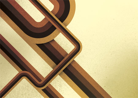
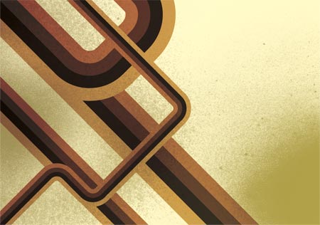
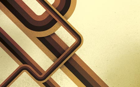
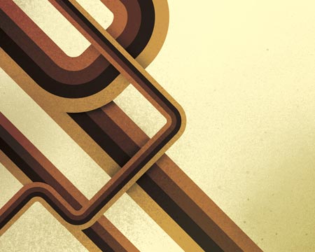
Starting with the design application of Adobe Illustrator create a group of vector based geometric lines at dynamic 45 degree angles, then follow the walkthrough to rough them up with brush textures in Adobe Photoshop resulting in a cool and trendy design style.

The use of angled lines adds a dynamic flair to the composition of a design allowing the viewers eye to follow them across the page. Combining this layout with colour, texture and typography can result in a cool, modern poster design.

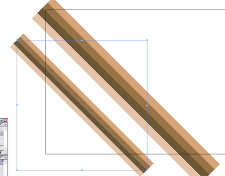
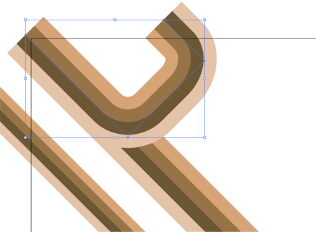
Start the design in Adobe Illustrator, draw out a number of blocks faced up to each other filled with the colour scheme of your choice.

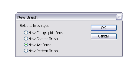
Select all the blocks and click the New Icon in the Brushes Palette, in the option box select New Art Brush.

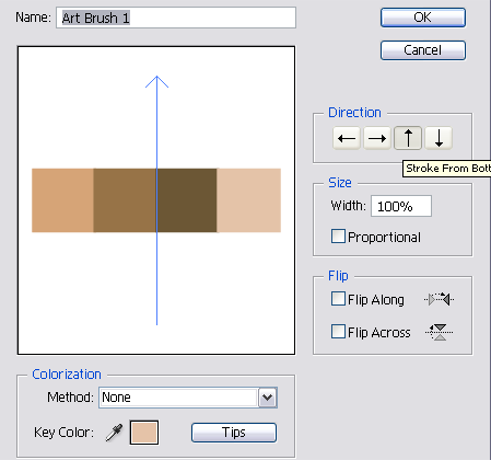
Check the direction of the brush is flowing in the correct direction using the arrow buttons.

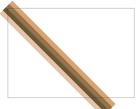
Now the brush is saved in the Brushes Palette begin drawing the geometric lines. Use the Pen Tool to draw a 45 degree line across the page, hold Shift to constrain the angle.
Click the custom brush from the Brushes Palette to apply to the striped effect.

Repeat the process with multiple lines, scaling them slightly to give varied sizes and widths.

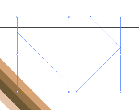
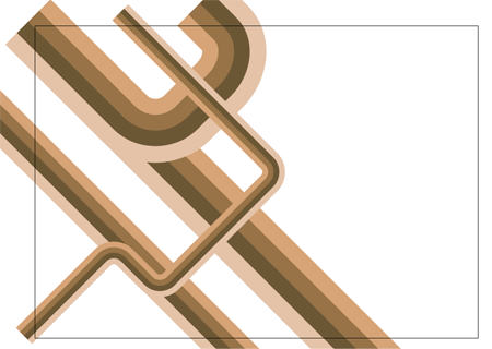
Produce another line with the Pen Tool, but this time alter the direction of the line back on itself, remember to hold Shift to constrain those angles to 45 degrees.

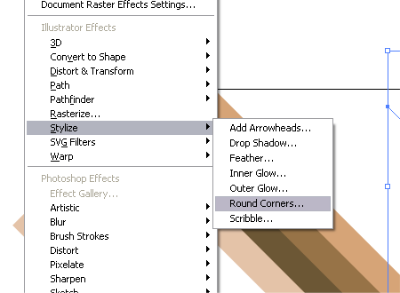
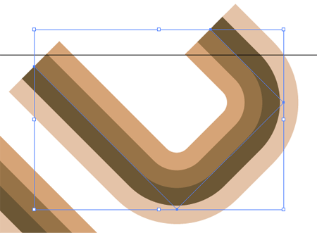
Give the line rounded corners by heading to Effect > Stylize > Round Corners.

Enter a desirable radius for the corners, for my document at A4 I used 30mm to give nice flowing edges.

Position the curved line over the large straight line, matching up the colours exactly.

Use the same process to create a longer curved line, this time flowing across the document crossing the other lines, maintaining those angles.

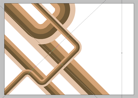
Select the group of lines and Copy, switch over to Adobe Photoshop and setup a new document. Paste in the lines and scale appropriately to crop off the extras beyond the edges of the page.

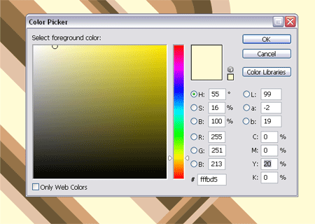
On the background layer fill the page with an accompanying colour, I use a 20% Yellow to give a pale tint.


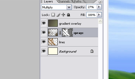
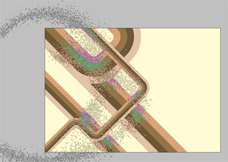
Sample a dark colour from the geometric lines and use a large spraypaint Photoshop Brush from my previous Photoshop Brush giveaways to place a couple of textured areas on a new layer.

Change the layer style to Multiply and drop the opacity to around 40% to tone down the texture.

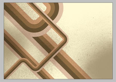
Select a couple of accompanying colours from the colour selector and draw a dark to light gradient across the page, set this layer to Color Burn to bring out the colours from the layers underneath.

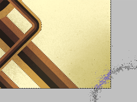
CTRL/CMD + Click on the geometric lines layer to make a selection, then create a layer mask on the spraypaint texture layer. Fill the selection with a 50% black to tone down the spraypaint texture beyond the edges of the main lines.

Use the spraypaint brushes to bring back a little texture to the same layer, painting in areas of white on the layer mask to bring back their visibility. This helps add a little tonal variety rather than an area of flat colour.

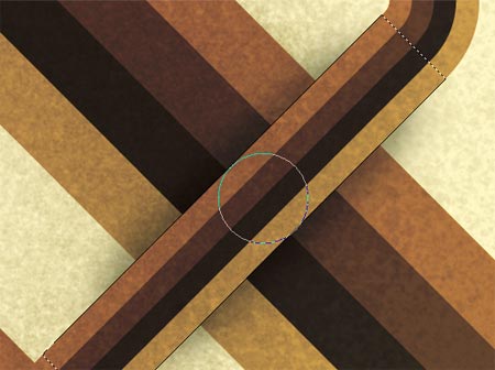
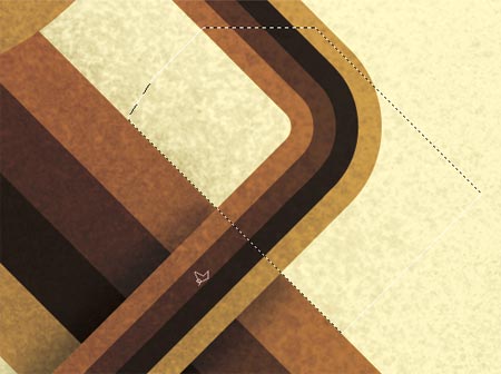
Duplicate the geometric lines layer and use the Polygonal Lasso Tool to select an overlapping area, remember that Shift key to get that exact 45 degree angle.
Inverse the selection and paint in a shadow with a large soft black brush.

Create a new selection around the unwanted extra from beyond the lines, add a Layer Mask and fill these with black to render them invisible.

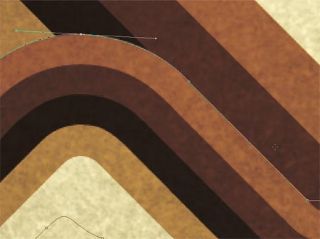
To repeat the process on a curved line use the Pen Tool instead of the Polygonal Lasso to create a flowing curve.

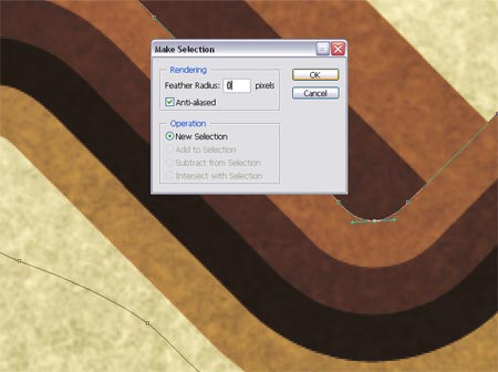
Right click and Make Selection from the path, do not add any feathering to ensure a crisp edge.

Add as many shadows as you see fit to add depth to the lines, feel free to download my version as a desktop wallpaper.

1680×1050 Widescreen Wallpaper

1280×1042 4:3 Wallpaper

320×480 iPhone Wallpaper

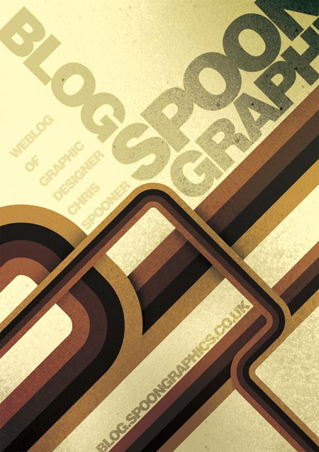
This design style works perfectly when accompanied with typography, add textual elements following the same angles and composition to create a trendy and modern poster:

Read More......
Disclaimer: Lots of Tutorial in this Blogs is from other site. If you dont like your tutorial in here contact me to delete it.